I see lots and lots of pricey extras you can buy for your photo editing program (namely Photoshop in it's various formats.) Usually these are the form of actions: a set of pre-programmed steps that Photoshop will perform on your photos to glam them up.
Some of these are pretty pricey ($150 and up). Some are free, and really good. Usually though, I've found the techniques to achieve the effect of the action are so simple to learn that you'd be better off just to LEARN them!
Since there's no sewing going on today I thought I'd share a couple of tricks. We're going to do a popular look in photos right now...color pop and vignetting. You might also see a similar effect called "Lomo" (that's a whole other blog post that I'll just leave you to google for the sake of time.)
Ok, so we're going to take a photo from just "good" to "smashing artistic interpretation of good". Or, you know, thereabouts.
So, step 1: open up a photo and duplicate the Background layer (Right click, Duplicate in the layer's palette.) Always work from a duplicate of the background! That way if you totally hate it, your original image is safe. I also never save over my originals. I'm using a perfectly decent photo of Lu:

step 2: First let's punch up the color in this one. It's a bit washed out. To do this, we're going to play with the levels in this photograph (how dark are the darks and how light are the lights). In Paintshop Pro, you Right Click on your layer and choose New Adjustment Layer > Levels. Looks this:
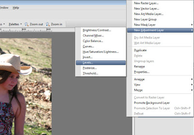
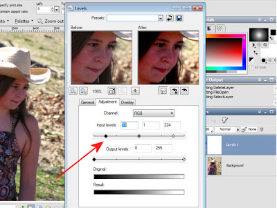
step 3: In the Levels dialog box, move the input sliders on each side in a bit. You can play with these to get the perfect contrast for your photo.
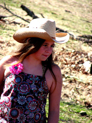
and here's what we have now...don't worry. We're not done.
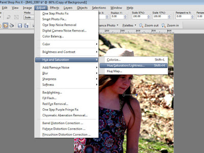
step 4: Now we're really going to get art-y and boost the saturation. This will really pop the colors of our photo. In Paintshop Pro, click on your duplicate layer and choose Adjust > Hue & Saturation> Hue/Saturation/Lightness from the menu:
step 5: We're going to leave the Hue at 0 and the Lightness at 0, but bump the saturation to 20. By all means play with these numbers as much as you like! Every photo is different. 20 is a good starting point though and you should see pretty saturated coloration now.
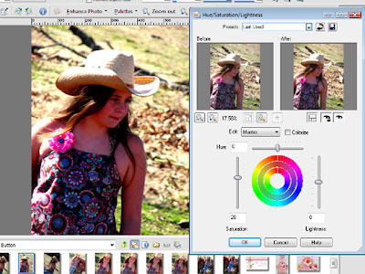
step 6: Now that we have a nice "color pop" to our photo, we're going to enhance that effect a bit by adding some vignetting. This is where the real "Lomo-effect" comes in! Add a new Layer above your Levels Layer. (Layer > New Raster Layer, or just click the little Layers button in the palette)
step 7: On this new, blank layer we're going to add a gradient fill with the Fill Bucket. Make sure you have the Fill Bucket tool selected and go to the topmost color in your Materials palette. Click on the color button and you will have 3 choices: solid, gradient, or pattern. We're going to choose the middle one: Gradient
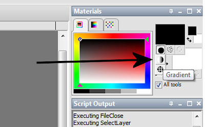
step 8: Now we want to change our gradient to the spherical gradient. You'll have to click on the foreground swatch (the top one) to open the Gradient dialog box. Choose Black & White as your Gradient from the little dropdown arrow.
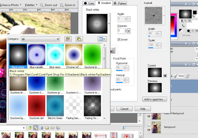
and choose the Sunburst gradient type. Before you click OK, check to make sure your Sunburst Gradient is Black on the edges with White in the center. If not, make sure the Invert is checked.
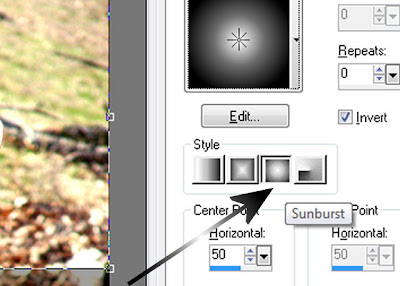
step 9: Fill the empty raster layer with this Sunburst Gradient. Don't Panic!! Yes, your picture is hidden, but only for a second.
step 10: Change this Layer's Blending Mode by clicking the down arrow next to "Normal" at the top of the Layer Palette. Down near the end of the list, choose "Overlay" as your blending mode. Yes, it's magic. :D
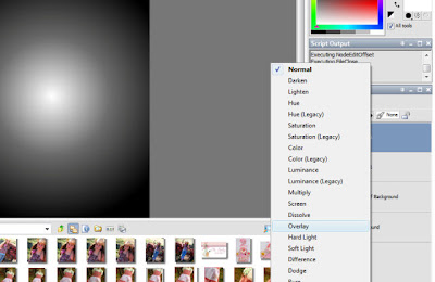
step 11: Wow, aren't you impressed with yourself now? As is, the picture should be pretty exciting now. But since it maybe a little "tooo" saturated and "toooo" vignette'd, we can change the Opacity of the Gradient Layer and the Saturation Layer as needed. Try to decrease either one (or both) to about 80-85%.
And Voila...here's our finished, color-popped, vignetted photo. Not too shabby, huh?
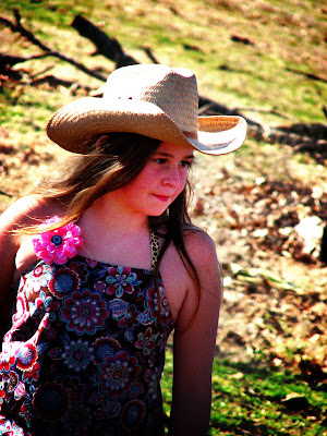
Final step...Once you're satisfied, Right Click and Merge > Merge All (Flatten). I recommend saving your photo with a new name so that you still have your original saved without all the fancy PSP footwork.
Now go! Play!

Wow, very cool! Thank you! I can sure use this tutorial. I just tried it on my older version of Photoshop, but will try it out on my Laptop later, which has PaintShop Pro. I'll post my picture (s) when I get something decent! You rock!!!! Thanks for photoshoppin' instead of sewing today!!
ReplyDelete*Heidi*
Isn't Photoshop fun!! I love it.
ReplyDeleteOh fuuuun! I don't have photoshop so I don't know if I can do this. :( But, I'll mess around with Paint.net and see. Thanks for the tutorial!
ReplyDelete