Thursday, June 26, 2008

Gulf Shores or Bust!


Leaving in the morning with the whole fam (plus 2 dogs!) Including dogs, we number 11. One person's torture, another person's vacation.

Nah...we'll have fun! We're like the Griswolds.

Was migraine sick yesterday and today I'm still recuperating from that, so no last minute sewing here. I'll be all rested & sewing-rejuvenated when I get back though!

See ya next week!

Tuesday, June 24, 2008

Photoshoppin'

Yoohoo... Heidi....this one's for you!

I see lots and lots of pricey extras you can buy for your photo editing program (namely Photoshop in it's various formats.) Usually these are the form of actions: a set of pre-programmed steps that Photoshop will perform on your photos to glam them up.

Some of these are pretty pricey ($150 and up). Some are free, and really good. Usually though, I've found the techniques to achieve the effect of the action are so simple to learn that you'd be better off just to LEARN them!

Since there's no sewing going on today I thought I'd share a couple of tricks. We're going to do a popular look in photos right now...color pop and vignetting. You might also see a similar effect called "Lomo" (that's a whole other blog post that I'll just leave you to google for the sake of time.)

Ok, so we're going to take a photo from just "good" to "smashing artistic interpretation of good". Or, you know, thereabouts.

So, step 1: open up a photo and duplicate the Background layer (Right click, Duplicate in the layer's palette.) Always work from a duplicate of the background! That way if you totally hate it, your original image is safe. I also never save over my originals. I'm using a perfectly decent photo of Lu:


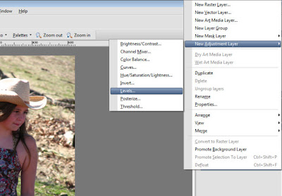
step 2: First let's punch up the color in this one. It's a bit washed out. To do this, we're going to play with the levels in this photograph (how dark are the darks and how light are the lights). In Paintshop Pro, you Right Click on your layer and choose New Adjustment Layer > Levels. Looks this:

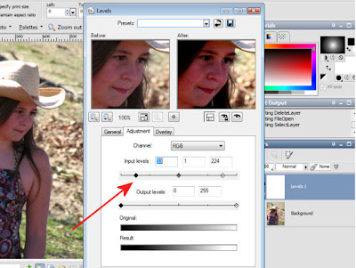
step 3: In the Levels dialog box, move the input sliders on each side in a bit. You can play with these to get the perfect contrast for your photo.

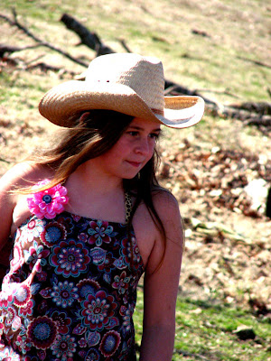
and here's what we have now...don't worry. We're not done.

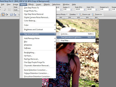
step 4: Now we're really going to get art-y and boost the saturation. This will really pop the colors of our photo. In Paintshop Pro, click on your duplicate layer and choose Adjust > Hue & Saturation> Hue/Saturation/Lightness from the menu:

step 5: We're going to leave the Hue at 0 and the Lightness at 0, but bump the saturation to 20. By all means play with these numbers as much as you like! Every photo is different. 20 is a good starting point though and you should see pretty saturated coloration now.
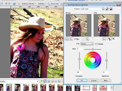

step 6: Now that we have a nice "color pop" to our photo, we're going to enhance that effect a bit by adding some vignetting. This is where the real "Lomo-effect" comes in! Add a new Layer above your Levels Layer. (Layer > New Raster Layer, or just click the little Layers button in the palette)

step 7: On this new, blank layer we're going to add a gradient fill with the Fill Bucket. Make sure you have the Fill Bucket tool selected and go to the topmost color in your Materials palette. Click on the color button and you will have 3 choices: solid, gradient, or pattern. We're going to choose the middle one: Gradient
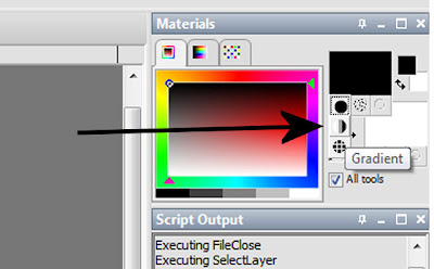

step 8: Now we want to change our gradient to the spherical gradient. You'll have to click on the foreground swatch (the top one) to open the Gradient dialog box. Choose Black & White as your Gradient from the little dropdown arrow.
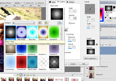

and choose the Sunburst gradient type. Before you click OK, check to make sure your Sunburst Gradient is Black on the edges with White in the center. If not, make sure the Invert is checked.
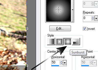


step 9: Fill the empty raster layer with this Sunburst Gradient. Don't Panic!! Yes, your picture is hidden, but only for a second.

step 10: Change this Layer's Blending Mode by clicking the down arrow next to "Normal" at the top of the Layer Palette. Down near the end of the list, choose "Overlay" as your blending mode. Yes, it's magic. :D
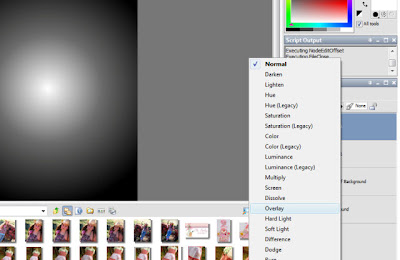

step 11: Wow, aren't you impressed with yourself now? As is, the picture should be pretty exciting now. But since it maybe a little "tooo" saturated and "toooo" vignette'd, we can change the Opacity of the Gradient Layer and the Saturation Layer as needed. Try to decrease either one (or both) to about 80-85%.

And Voila...here's our finished, color-popped, vignetted photo. Not too shabby, huh?
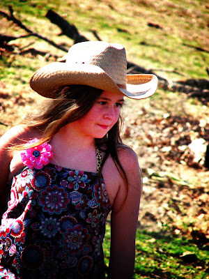

Final step...Once you're satisfied, Right Click and Merge > Merge All (Flatten). I recommend saving your photo with a new name so that you still have your original saved without all the fancy PSP footwork.

Now go! Play!

Sunday, June 22, 2008

BWOF 6-08-123

If you find yourself humming the Flashdance theme later today...I take full responsibility.


(Please ignore the blatant jazz hands.) Yup, my photo is off-center. But I took this blasted picture with my camera timer 15 times. This was the best of the lot.

Ok, the BEST of the lot was probably this one, but I cut my head off. And the whole point of me photog'ing ME was so you could see my lovely (no shower yet --it's 7 a.m.-- no hair do, no make up) face. Plus, I look like I don't have a neck in this one. On the positive side, no jazz hands.


And I tried cropping the first one so that it was just the ME face and the top, but I look all out of proportion without ankles. I'm glad I have them in real life.

Here's my shoes, since I put them on special for the "shoot" and they were cut off by my timer suckage:

Yes my friends, to complete the post-disco era fashion statement I give you disco ball flip-flops (or as I like to call them--loudly, in front of Lu, in public--THONGS.) Tar-jay, $12.99.

Oh yeah, back to the pattern. I love it. It's not something I'll be making again in several colors, obviously. But it turned out SO cute. I'm going on vacation at the end of the week and this is a perfect beach vacation top.

It's still unhemmed, because I'm not sure about the length. I played with it last night and it actually looks cute shorter, but there's something sloppy and fun about the longer length so I'll probably leave it.

I cut the 46 and the only alteration I made was to scoot the CF over about 1.5" to allow for my chest appendages. I don't think the BWOF model had any, so I figured I better make allowances.

I did run into a bit of "I have to walk away or I'm going to rip this goshforsaken magazine to shreds" trouble with the neckline. Here' the line drawing:

So, after you bind the holes over the shoulders (easy), you go to work on the neckbands. The odd part (to me) is that you do the front & back bands separately before ever attaching at shoulder seams. The other odd part is that their directions for applying the neckband facings SUCK. (ok, not odd.) Ahem.

To save you a lot of hair-pulling, I'll share what I eventually figured out (one Fool's Gold viewing and a trip to WM for Tylenol later.) You place the front neckband & facing RST and stitch the top (neck) side completely across. Then on the bottom side of the facing/neckband, you only stitch up to the edge of the shoulder-hole binding. Then you have this little bit of a "tube" to turn right sides out. That's it. There's a whole convoluted paragraph in BWOF on this, but this is actually what they meant. Repeat for the back facing/neckband.

Then you just press under the remaining seam allowances of the facings and baste, topstitch. I skipped the basting because I'm a rebel like that. (I did pin.) To join the neckbands, you stitch the neckband at the shoulder seams, and then hand-stitch the facing closed (the facing seam allowance was pressed under earlier.)

And while you'd think watching Kate Hudson cavorting about in a tiny bikini with Matthew McConaughey would diminish my desire to wear a sexy hole-shoulder top...you'd be so wrong! Look at my cute shoulders in those holes!

And those ankles. Wow.

Thursday, June 19, 2008

Little Skirt

Just playing with fabrics today! Three little skirts that will go in my Etsy Shop!


Now it's back to our regularly schedule grown-up sewing. My BWOF June issue FINALLY CAME!! Woohoo!! Haven't fully digested it, so this is short. I'm drinking lemonade and enjoying my magazine to its fullest!

All are SOLD...Thank you!

Tuesday, June 17, 2008

Ottobre 4/07 #33

Summer tee for my whiny girl, who has been giving me that "sew neglected" look for a couple of weeks now. ;)


This pattern is the long-sleeve tee (pattern #33) from Ottobre issue 4/2007. I used a blue & white stripe cotton knit, with a black & white polkadot for the yoke & bindings. I was feeling a little saucy, so I used hot pink thread and a double needle for all topstitching.


This blue & white knit has been in my stash for at least 8 years. (I still have about 1.25 yards left!) The top pattern #33 has long sleeves, but I just substituted the short puffed sleeve from pattern #31 in the same issue instead. The sleeve fit perfectly, which makes this a very versatile pattern!


The pattern calls for ribbing, which I missed in the instructions when cutting out. AFTER I had cut all the pieces and sat down to read through construction, I discovered that part. I worried the bindings wouldn't fit, but they went together PERFECT. The only problem is that the neck opening is a just a tad small. Lu can pull it on over her head, but it would have been a lot easier if I had used ribbing instead! Ditto for the sleeves, which I doublechecked the fit of before stitching just in case.

I love Ottobre! This was a fast & easy project! And all the pieces just go together perfectly (even swapping out the sleeves and nary a hiccup!)